Learning how to program iOS – Part 2

A quick update on Chapter 2 of “iOS Application Development” which covered Xcode and the iOS simulator. I had played with an older version of Xcode (3.2 I think?) with the current version being 4.6 as I write this – seems like a lot has changed. I think the IDE has greatly improved – I like the Assistant Editor which pulls up header (.h) files in a separate side window from the current implementation (.m) files, and I like snapshots and the visual diffs they show, plus the error/warning feedback seems much better than I remember it.

I think the one thing I really like about learning from a book as opposed to finding stuff on the web – it’s great having everything in one place, and it’s great having stuff grouped together. It was nice to read a quick overview of the iOS Simulator’s capabilities, something I had never even thought to look up.

Now comes the actual learning part – starting the Objective-C portion next..

Learning how to program iOS – Part 1

I’ve been wanting to learn how to develop iOS applications since the iPhone first came out, not because I have the perfect idea for an app but mainly just curiosity. I’ve dabbled a bit here and there, using some of the Apple documentation (which is pretty awful for those just starting out), but it’s just so graphically oriented, and that is so not my thing – that’s probably why I never really did it. I almost took an in-person class starting a couple of weeks ago – there’s something about having to actually show up at a specific place and time that’s very appealing to my procrastinational nature, but I was told by other iOS developers that it didn’t have a good syllabus and that it would teach me the bare minimum and also how most iOS developers DON’T write iOS apps so I skipped.

However, I’ve got a client with an existing iOS application that needs work, so now’s my chance to really jump in with both feet. I’m using a book I just bought: “iOS Application Development in 24 Hours”. It was the newest and highest rated book available (just released actually), and I have been told that Apple keeps changing Xcode and the libraries from version to version and sometimes they’re not backwards compatible, so it’s best to be developing with the latest information and the latest versions.

The first chapter was some good starting information about the the devices themselves, including the Retina display, which if you were using an earlier book, would not have mentioned. It also had some information about signing up for the iOS developer program through Apple, though not nearly enough in my opinion.

Moving from Apache to Nginx – wow!

I have been meaning to switch this site from Apache to Nginx for a while now – actually, to tune this website a bit better as a whole. I’ve been using various tools (Google PageSpeed, http://www.monitor.us, http://www.pingdom.com) to track the results and I thought I would recap how things have gone.

When I first started this project, I had a plain vanilla WordPress with no optimization running a handful of plugins on an old Dell 1U Solaris server using Apache+mod_php. PageSpeed showed my initial score to be 75. An infrequent monitor.us performance monitoring was telling me the average response time was about 650ms as a baseline.

My first step was to resize all the “system” images (NOT the gallery images). This bumped the PageSpeed score up to 77.

I tried installing W3 Total Cache, but the whole install was a mess. It wants to run to /wp-content, requests 777 permissions, etc. I had problems with the page display getting messed up, even after clearing the cache. Even though the pages were messed up, the PageSpeed score went to 81. I’m sure I could have figured how to actually get it up and running the way I wanted, but I wanted to do all this by hand anyway, so I scrapped Total Cache and moved on – back to Page Speed score 77.

Next up – enabling mod_gzip on Apache. PageSpeed score increased to 81 – not bad for a simple modification.

I was going to try and install mod_pagespeed from Google, but I had no luck getting it to compile with gcc under Solaris. I love Solaris, but I swear I need to switch to Linux one of these days. None of the new software compiles under Solaris. My list of stuff I can’t get to compile is long: mongodb, mcrypt, mysql-5.5.x, newrelic – and those are just the relics sitting in my /usr/local/src directory that I haven’t deleted in frustration.

Next I installed some object caching via APC, but the PageSpeed score stayed at 81. Adding sendfile and MMAP via the Apache httpd.conf bumped it up to 83.
It was at this point that I started a trial of Pingdom to track the page response times on a more granular level. However, Pingdom was showing page response times of around 975ms, which surprised me since monitor.us showed a drop from 650ms to around 587ms. I wish now I had a baseline number from Pingdom before starting any of this, but oh well.
Next up was the big change – moving from Apache to Nginx+php-fpm. After getting everything configured and tested, I switched. WOW! PageSpeed reports 94, and Pingdom reports response time dropping from 975ms to 237ms (see graphic). Talk about immediate results!
There’s more tuning I plan on doing (like implementing a CDN via S3), though I think all the big gains have been achieved. I’ll update the blog as I get the results.

How to process your RSS feeds quickly and easily

This blog post has been a long time coming, but better late than never!

I’ve talked to a lot of people who say they can’t keep up the flood of information these days, so I wanted to share my system for processing RSS feeds. I’ve got about 600 (!) active feeds that update at various intervals, but it’s certainly a chore to keep up with them.

I use my iPad 3 with Feeddler Pro to quickly scan feeds. I’ve tried almost every RSS feed reader on the iPad, and Feeddler Pro’s interface is the best for skimming/scanning feeds. It interfaces with Instapaper (another one of my favorites) for saving a long-form article in the cloud that I want to read later (on my iPad, my iPhone, my laptop or my desktop).

However, sometimes there are articles that I specifically want to open and read on my desktop (or laptop), and saving in Instapaper doesn’t quite work for me. Luckily, Feeddler Pro’s interface allows you to “star” (or mark as favorite) articles trivially easy. So you can zip through your feeds, starring anything that’s interesting.

My problem was I never remembered to go back and dig out those articles from the Starred Article section.

So I wrote a script (https://github.com/heybige/greader) to log in to my Google Reader account, grab (and delete) all the starred URLs and send them to me in an email via a crontab every day at 11:59pm:

59 23 * * * ( /usr/local/bin/daily.php )

For those of you technical enough to understand crons and PHP, enjoy!

Another Startup Weekend under my belt – Day 1

Well, that was certainly quite a weekend! Talk about going from one extreme to the other..  but I’m getting ahead of myself.

First, a little about the space and the start of the weekend – I had heard about The Makers Space in the Twitterverse, and seen pictures from the opening night party and other events, but for some reason, I was thinking that it was down in South Lake Union, presumably because I remember reading about all those new condos on Lenora and just associated Lenora with SLU. So here I was researching parking options in SLU when I looked up the address to see where the building was only to discover that the building is actually in Belltown close to the Pike Place Market – whoops!

I busted out my trusty Seattle parking app (don’t park downtown without it!) and discovered a previously unknown parking garage at 61 Lenora that has inexpensive $6.00/evening parking from 4pm-1:30am.. highly recommended! Of course, it was $23.00/day on Saturday, but that was for 7am to 11:45pm which I don’t consider unreasonable at all.

Startup Seattle at Makers SpaceThe space was scheduled to open at 5pm, and I arrived shortly after that, with networking in full swing.  I had some great conversations and met some really interesting people before the pitches started. My favorite conversation of the whole weekend was an extended conversation with @colindchapman about all things technical: Rails, ORM, MVCs and specifically Node.js + Express. Since it seemed we had similar tastes and complaints as far as MVCs go, he made a very persuasive case for exploring those, so that’s on the agenda for the week.

An aside – if you’re thinking about attending Startup Weekend, I would HIGHLY recommend attending the free Bootcamp in the days leading up to the event. You’ll get an idea of how to integrate your laptop with how everyone else will likely be configured (with regard to file/code sharing), but even more so, you’ll get a chance to network on a smaller scale, so when you arrive at the event, you already know a handful of people.

At my first SW, I just listened intently to the pitches, but I didn’t realize how many there were going to be, and how hard it would be to keep track of them all. When all the pitches were completed, I could barely remember which ideas I liked, and who pitched them. I was determined not to make that mistake again, so I was jotting names and notes during the pitches this time around. There were some interesting pitches (Bookstream: netflix for books, MyStructure: universal PIM API, Startup Stock Market simulator, a live QR/bar-code feedback system from @colindchapman actually that I didn’t catch the name of, among others) that I was surprised didn’t get more traction, and frankly some ideas that I was surprised did get traction. C’est la vie!

A tip if you’re going to pitch – state your name clearly at the beginning, speak clearly, and at least have a catchy name or phrase (doesn’t have to be your final brand name) to repeat through and/or close with. I took notes on every pitch, and I have maybe 20% of the pitches that I missed the person’s name because they didn’t say it, or they mumbled it, or the concept name wasn’t mentioned or wasn’t clear so I didn’t know what to call it. I think the reason some ideas don’t get more traction is that they are unmemorable or don’t stand out. If you don’t take notes (like I did), it’s hard to remember who said what, and having those things that stick in your memory really help!

I had planned to pitch this time – I contemplated several interesting ideas, had selected one which was solved a problem I am continuously having, had the pitch down in my head cold, and for whatever reason just didn’t feel like “going for it”.  In retrospect, I wish I would have pitched (and hopefully made it to the team selection round) but hindsight is 20/20. In the end, there wasn’t any idea that I was super jazzed about – and I honestly just figured I would float around and see if anyone needed any help. It would give me a chance to meet and talk with everyone, and not have an uber-stressful weekend, plus I wanted to post more pictures, tweet and live-blog a bit more.

Well, that didn’t happen. I ended up talking to Saia Taumoefolau who was in from Chicago on a lark who managed to snag a ticket at the last minute and planned to pitch an idea about sub-prime auto loans, something he was extremely knowledgeable and passionate about. He had already picked up a team member Jessi who had abandoned her (I thought) really interesting Crossfit idea to join his team. So my options were: float and coast, or jump in and help. I jumped, though I had no idea what I was jumping into.

For some reason, I thought we had more members to our team. It didn’t really hit me until we actually sat down and started discussing the aspects of the project that I started to worry. We had no graphics people, we had no html/css wranglers and two people who had never been to a Startup Weekend before and thus had no idea what was going on or what to expect. It was going to be a long weekend..

(to be continued)

Rant of the Day: Facebook Timeline

Am I the only one that sees Facebook Timeline as a sub-feature instead of a complete interface? Strictly from a UX point of view, it doesn’t make sense – if you’re friends with someone, why do you (as a friend) need to go back and review that person’s history? I don’t need to have instant access to what my friends were doing 1-2-5 years ago, I (should) already know that – I care about what they’re doing now!

Now, I love the concept of Timeline, if it were delivered as a sub-function. How about a menu link called ‘Timeline’ that allows me to see the history of that person (assuming we’re friends). I might meet someone new, become FB friends and be curious about that person’s background – hey, great! But you don’t put all that stuff up front, especially for close friends (which is what Facebook is SUPPOSED to be for – duhh!).

Oddly, I’ve been hearing warnings about being forced to move to Timeline, but I’m still rocking the classic interface, and so are a lot of my friends. On pure speculation, I suspect that the people who have Timeline implemented on their profiles have a decreased activity level (reading, posts, sharing, likes, etc) that Facebook is picking up on. There has to be a reason, because they announced it in September 2011, and have made several announcements that Timeline will soon be ‘mandatory’ and yet there’s still a sizable segment of the audience who haven’t been converted.

I, for one, can’t stand Timeline as an interface – it’s haphazard and disjointed. Things are hard to follow chronologically, and it feels rightly squished, and I KNOW I’m not the only one. If I’m forced to switch over, I’ll probably find myself using Facebook less, maybe much less, and again, I KNOW I’m not the only one.

So Facebook – pay heed to the gripes of your (admittedly) freeloading ‘customers’, because your Timeline interface is the blinking, bizarre font colors of yesteryear’s Myspace..

UPDATE: Now I feel even more strongly that Timeline has been a negative for Facebook, per their new acqui-hire:

“Facebook tests product changes more frequently than nearly any service. Bringing in Nate Bolt and some of his teammates will help it understand exactly how users feel about changes and avoid blunders like Beacon.

Right now, Facebook typically pushes design changes to a tiny fraction of its user base through its Gatekeeper system. It then watches the usage data to see if users engage with new features or changes, and how engagement, sharing, and time-on-site change. Changes that improve these metrics often get pushed to the whole user base. Innovating and iterating in a way that pushes people’s boundaries is good, but Facebook needs to be careful not to roll out new features too far before its users are ready for the future.”

Sync AdBlockPlus list(s) across multiple computers

If you’re like me, you are militant about blocking all kinds of annoying crap on the web – fly-in and popup boxes, annoying backgrounds and animated graphics, and the rest of the things designers do to “engage” users. Now I’m extremely hypocritical about this because I have also used these tools when directing designers because I know they work, so I don’t begrudge them. That doesn’t mean I have to deal with them though either, especially if it’s for a site I know I want to come back to.

Enter AdBlockPlus (for both Chrome and Firefox) – an invaluable tool for navigating the web.

One of the problems I’ve had is keeping my block lists sync’ed between laptop and desktop, and between Chrome and Firefox. Ideally, you block it in one place and have that block propagated everywhere. One way to do that is with your own custom block list.

I just created a file on one of my servers with an initial structure copying what one of the other block lists looked like. I then manually edited that list, adding in all the various elements from both my local block lists from my desktop and laptop, and from Chrome and Firefox. I recommend keeping related items together (whitelisted domains in one section, blocked DIV elements in another, etc) and sorted so that you don’t duplicate entries. I also put this file under Git so I could keep track of what’s been added or changed.

Then add that custom list to each of your ABP block lists. Any time you want to block something, you add it to the centralized custom list and it’s automatically blocked across all your ABP installs.

Google, you are losing your way

I have loved using Google since discovering it when everyone was still in love with Altavista. Lightweight, and blindingly fast – built by and for engineers. But something has gone terribly wrong over there it seems.

My prima facie evidence: Google Reader. I used to LOVE using GReader. Sure, I wish it had some additional bells and whistles, especially Yahoo Pipes-like filtering and being able to add/change the keyboard commands, but it was certainly functional and fast, and it worked equally well on both laptops and desktops.

But they decided to change it for some reason. First, the layout: just horrible, piss-poor design. Whoever approved this design should be immediately fired. Gone was the clean, tight, effective design. In its place: huge, clunky buttons with big gross chunks of stupid whitespace.  Eventually they offered spacing options (Comfortable, Cozy and Compact) but even the Compact version can’t come close to the old interface.

I could live with the abysmal interface, because it’s still more functional than everything else I’ve looked at, but one thing that I almost can’t live with is the speed. It’s become molasses slow. The interface is all AJAX now, and it’s become disgustingly slow to update – almost to the point of being unusable. It’s so slow they had to install an “hourglass” animated globe that lets you know something’s happening in the background, otherwise you’d think something was broken. That’s not the Google I know – the Google that pushes technologies and techniques that lower page load times.

I’ve looked at a significant number of other solutions, and they’re as bad, if not worse. So I’m stuck at the moment – hoping either Google can pull their head out of their ass or another company comes up with the old version of GReader (preferably with added bells and whistles!)

And I’m not the only one. The Google Reader group was flooded (and is still flooded) with complaints about the page loading, the new UX/UI, and other changes they’ve made. The thing that bothers me about this is that Google launched this giant turd at the end of October, and it’s STILL looking and running like shit. Is anyone even working on this any more?

Of course, they did the same thing with Google Calendar. The old one was more than adequate – most people I know were perfectly happy. I had switched over to the new version to check it out, but switched back after a few days, mostly because I hated the translucent pastel colors that blended too easily with the white background. Now they’ve forced the new version on everyone so you’re forced to use the inferior version.

(hint: go to Settings > Labs and ‘Enable Background Images’, then upload a light grey image you create in Photoshop that you can set as your tiled background image to give some contrast with the white background)

Sure, you can install Greasemonkey or Stylish and change many of these settings, but I already have a problem with Firefox chewing up memory and those plugins seem to exacerbate the problem. Plus these products worked before – they shouldn’t have been broken being “upgraded”!

I mean clearly all these changes are focused on getting people to use Google+ and it’s readily apparent that Google is absolutely terrified of Facebook but so much so that I think they’ve completely lost who they are as a company. They are leveraging all their properties into pushing Google+ to respond to Facebook, and it’s negatively affecting their customers (things like the privacy settings changes).

And it’s not just the Facebook threat – there are other examples (like the Mocality fiasco, and hiding the search terms) that just don’t seem like the Google from before. What happened to that company?

New tool for weekly planning: Teux Deux

I’m not sure about you, but I struggle with planning and prioritizing things. My problem is that I’m too efficient at capturing thoughts and ideas, and I’m always overwhelmed by what things I should be doing because my ‘to do’ list is way too long!

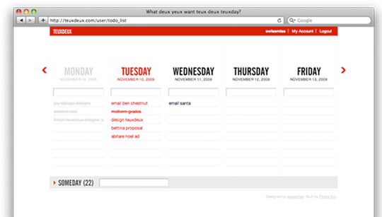
One of the productivity steps I’ve read about but had problems implementing was planning out the major things I’d like to get accomplished in the week ahead. All the techniques I tried to visualize and track this data never seemed to work for me until I remembered a piece of software I had demo’ed long ago – Teux Deux:

Teux Deux screencapture

I love the layout – perfect for visualizing the tasks allocated each day for the whole week. If you don’t finish the tasks for a day, they’re automatically moved to the next day which is helpful. Once you enter a string/task, you can re-arrange the order (or move to another day) by dragging and dropping. You can also check off the task once it’s done (shows a line drawn through the task) or click an ‘x’ at the end of the line to delete it. Unfortunately, to edit a string, you need to delete it and re-add it which is kind of stupid. Helps to read the FAQ: you can edit a string by dragging to the inpput box! But it does have an iPhone app now so you can take your list with you.

Give it a try and see if it can’t help you focus on getting more major accomplishments done each week!

Cooling Stand for Mac Book Pro from Mad Minds

I just wanted to pass along a tip to those of you with Mac Book Pros. As you well know, the bottom can get pretty hot, especially when it’s sitting in your lap! I had another cheap wedge-shaped plastic pad that I had doctored up with non-slip drawer lattice to keep it from sliding around. It actually worked great, but I ran across The Tilt from Mad Minds a while back:

The Tilt from Mad Minds

http://www.kickstarter.com/projects/themadminds/the-tilt-multimedia-stand-for-the-macbook-pro

I had ordered it in mid-December and it was on backorder, but it finally arrived this week and it’s slick!  It clips on firmly to the bottom of the MBP, and it has a USB plug-in to power the fan which is remarkably capable of keeping things cool without adding too much thickness or weight to things.

I highly recommend it to anyone with a Mac Book Pro!